45% discount promotion on all items for and till 24th of december
Infront Camping Gear 45% Discount Christmas Promotion till 24th Dec
Last edited 17/11/2014 - 15:04 by 1 other user
Related Stores
closed Comments

doesn't seem to be that hard to navigate

it does a search feature!

How many ways can we count the wrong?
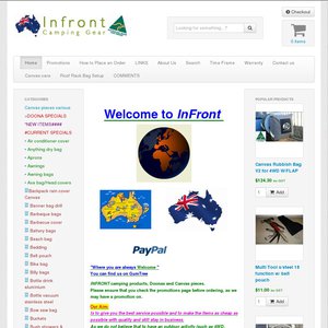
Just like DIY TV commercials - unless you are an artistically talented nerd/graphic designer/web designer you will lose customers if you do your own web site. It looks pretty average - like a web page output from MS Word 15 years ago. Spelling mistakes (perhaps get a native English speaking editor to check it Klaus?), font disease (random multi-colours & bold/italic), imperial measurements, loads of basic web design flaws. Although 'Doona' is in common parlance (like Hoover in the UK) I reckon it might be copyright - better to use 'quilt').
You might even get away with an up front explanation along the lines of - 'To save money and keep costs down we do our web site - can't you tell?'
While you can go the other way and overdo the slickness and sell/sell on a properly commercial site, you can still go professionally designed and retain the home cooked family business feel. I would suggest as soon as you raise enough to get a site properly designed.
All the basic elements are there, so good on you for having a go, but it needs polishing.

if you have nothing good to say, say nothing

Just trying to help you. You can take it as all negative if you like. Given that this is the sales vehicle that will give potential buyers the impression of your business, I think it's quite important how your site appears, not just that the information is there.

People brought the same comments up two years ago
If you have potential buyers all feeding back the same message, it might be worth redesigning

Well, sh*t. If it's been this way for 2 years or more there's no excuse - that's just plain stupidity or stubbornness. No sense of marketing or sales.

Is this Web 1.0? The pictures of products are not clear enough - they've taken their own photos of products then used paint to cut out the background. Here's an example: http://www.infrontcampinggear.com.au/sleeping-bag-230-x-85-m…
But that sleeping bag looks okay for the price. I just wish I knew exactly what I was buying.
The problem is Klaus - we wonder 'if this is the thought and care they put into the web site - are the products the same quality?' It doesn't need $1000's spent on it, just decent proofreading and a consistent & logical layout. It's obvious you're DIY in house, but you don't have the skills. Pay someone to set it up nicely in a manner that allows you to then change the content keeping the style as they set it. This means you don't have to keep paying that person to run it - just the initial site creation, art & setup.


Some good deals, but I gave up trying to navigate the website.