• expired

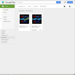
[Google Play] What's Next - Music App for Parties - $0.99 (66% off)

170

TL;DR - Music app for parties - Everyone votes for the music to be played! Links at bottom.

We have been developing a music app, right now the basic versions are released on Android.
It is a music app for multiple users that allows guests connect to the host device via WiFi or Hot-spot, which then displays the playlist and allows them to vote for what they want to listen to.
Gusts have the ability to upload their own songs to be added to the list, if the host allows it.
Version 1.04 is out at the moment. (links at the bottom of the post)
This version comes with a few known bugs, being laggy on some devices, sometimes needing to skip the 1st song on startup and a few other minor bugs. Overall it is a solid app that works very well.
Great for house parties or casual gatherings, possible use in pubs/clubs/events.

If you like what you see, or think the idea has some potential, please support the app as we are currently working on version 2.0.
Purchasing it now at 66% off will help in developing the new version, getting it out there much quicker. Trying it out at the next party you attend and spreading the word will also help!
The new version will have a more modern easy to use UI with many new features, eventually functioning as a stand alone music player, to be used anywhere.
Ultimately it will be Cross compatible with Android and Apple products so no one will miss out.

Any feedback you can give would be great. What features you would like to see? What have you always wanted in a music app that just isn't there?

Below are the Free / Paid (66% off) links to the play store. Also the Facebook Page, and an amateur video we made demonstrating the app. Please check it out and let us know what you think!

FREE:
https://play.google.com/store/apps/details?id=com.info.whats…

PAID (66% off right now):
https://play.google.com/store/apps/details?id=com.info.whats…

Facebook:
https://www.facebook.com/WhatsNext.MusicApp

YouTube Vid:
https://www.youtube.com/watch?v=P7JpN4ispyg

Cheers!

Related Stores

Google Play
Google Play
Marketplace
Google Play Z-Man Horizons

closed Comments

  • Very clever idea. Have a plus.

    • Cheers mate

  • Interesting, just bought the paid version, will try it out soon

    • thanks!

  • Great idea, it has been done before a few times but no one has really nailed it yet, so there's a great opportunity here!
    It definitely appears that you're a programmer and not a designer, as both the design and demo video are pretty awful, so hopefully you can get some material design stuff going in v2.0.
    Good luck mate!

    • +2

      yep, I had been looking for similar apps, and like you say never found any that hit the mark. As for the video… 1st ever one I'd made… so yea, pretty average haha. Altho i cant share them yet, preliminary designs for V2.0 are complete, and it looks amazing compared to what we have now. Thanks for the comment

      • Sounds promising! Are you developing this yourself?
        I'd definitely change the logo, the basis of good design is meaning and the electricity/heartbeat thing isn't conveying the ideas behind the app (plus it looks like it was made in Paint hahah).
        The interface is overcomplicated and needs simplifying. I think you need to create a visual hierarchy and emphasise the most important and most used controls. At the moment everything is placed all over the screen with no logical arrangement.
        There's also a heap of basic spelling and grammar issues that need addressing.

        • +2

          Long story short, Im the idea person, been dreaming it up for a year or so. Im hiring developers to do it for me with personal funding. So I guess Im producing it and moulding it to my vision. 1st lot of developers gave me what we have so far. (I sourced them from freelancer and as you can see its not what it could be haha)
          Version 2.0 is being rebuilt by new devs with muuuch better knowledge.
          What we have now works, its functional, and with a little practice easy to use. But like you say needs cleaning up, and needs to be cross compatible with apple.
          I use it at parties I host at home, and everybody loves it. They get really excited when a song they chose plays haha.
          Funnily enough I made the logo in Paint.net.
          Everything you have mentioned is fixed in the wire frames I have of version 2.0 :-D

  • +1

    I'm buying it just because I like the initiative. Whether I use it or not is another thing!
    One thing I like about having functions at my place is I CONTROL THE MUSIC! but to allow people to choose what to play 'from my library' is a good idea.
    I might try it over Xmas.

    • nice :) if you decide to use it on Xmas, because you purchased it you can modify the server when you make it (which is locked on the free version). Just change "allow user to add music?" from yes to no. Pretty straight forward.

  • Bought it in support! Good luck guys :o)

    • Much appreciated!

  • +3

    Awesome concept, not sure what else is out there similar but first I've heard of it. You might have some tough competition though if UsTwo devs have released something similar, what is your point of difference?

    Not sure how much you want to spend out of your own pocket but I think it would be worth getting someone to skin it for you to give it a bit more shine. Or at least the icon itself as it doesn't really sell the app well IMHO. Suggest you consider either running a design contest at www.99designs.com and see what people come up with for $X that you define, or checking out www.fiverr.com and finding an icon designer which you think might be good to work with. It will work out quite cheap and could be money well spent as the Icon is what will draw buyers initially, fail at that first step and its hard to get traction.

    I know how hard it is to get an app off the ground and it can get quite disheartening at times… but keep at it. I released a music related app about a year ago for iOS called Acidik Wearable Audio Visualizer, still hasnt paid for itself yet and those Apple membership fees keep stabbing me in the gut each year as well but I continue to hold out a little hope. Check it out at www.acidik.com if you are interested, freebie download.

    Happy to discuss further if you want to have a chat about any aspect, I've probably learnt a few tricks over the last year. Just gave you a bit of a plug via my facebook page at www.facebook.com/acidikapp (although not a lot of members so don't expect too much… haha).

    Edit: Was just thinking… imagine if you could get the interest of a band on board and they used it as a gimmick on a tour whereby audience members could influence the set list live. Bands are likely looking for new gimmicks and if no-one has done it before I think it might get some interest.

    • +3

      I saw Hoodoo Gurus at a show once and they got the crowd to call out suggestions and then they played them. This could be the modern way!

    • Love the website and video, looks very professional. I dont personally have an Iphone so i cant try it out, looks like a great idea, especially for when you just want to chill and listen to music. Would work perfect with something like a Samsung Gear VR - or google cardboard even. An actual VR version would look epic.

      As for my app, the wire frames for V2.0 look really good, they are so much cleaner and professional. Biggest part is funding at this point in time. As Im using new devs and rebuilding from scratch to make it cross compatible.

      I plan on having different modes, so say "DJ mode" would broadcast the DJ's playlist and let guests vote for songs they have, so they can get a feel for what the people want. The phone dosent actually have to play any music itself. It would just be a useful tool. SOOO many ideas to make this app different to anything else out there. I love my technology and all that.

      • Thanks, the Acidik website is just a wordpress template that seemed to do roughly what I wanted, then I added my own images and a few touches here and there. The video I did myself just in Windows Movie maker, I have very little experience with video so was fairly happy with the result. I started out with the intention of doing a test run of the filming but it surprisingly turned out quite good first time around so ended up using it… my wife offered her eyes at no cost. :) The voiceover was via fiverr.com and was a hiphop DJ from Melbourne, cost me like US$20 or something silly.

        I've had a few people suggest I make it VR compatible, but truely I think the beauty is you don't need a VR headset or google cardboard at all. It actually works really well with your eyes closed and that is perhaps the most relaxing way to use it, the light shines through your eyelids and you can distinguish colours as well. You really need to use it in a dark room at night though, and need to be laying on your back or the effect doesnt really work well.

        Good to hear that V2 of your app is getting some polish. Getting a developer to match your vision or even your mockups can sometimes be a battle.

        Have you considered implementing a web based server to accommodate LOTS of voters for say at a rave or something (what is your maximum simultaneous users) ? You could even have the app produce a QR Code so that users just point their phone at the printed code (or up on a video screen) and takes them straight to the playlist voting page for that party. Would save logging in and some party hosts might not like the idea of guests having access to their network.

        • Ive tested 50 emulated users (fake users off the pc) and had 20+ people logged in at once with actual phones. Worked well with no problems, so maximum should be over 50 id say. but yea lots of ideas once it picks up a bit after 2.0 is sorted :-P

          also, thank you for the shout out on your Acidik Facebook page :) favor returned ^_^

        • +1

          @Z-Man Horizons: Cool stuff, looking forward to seeing what you come up with for V2, particularly for iOS.

  • Great idea, purchased :)

    • Cheers mate ^_^ Enjoy.

  • +1

    Purchased ☺️ all the best!!

  • +1

    bought it!

  • +1

    I'm trying to think of a icon idea that would work well.

    Antique Scales with musical notes on both sides and tipped to one side.

    One of those chocolate grabber machines you see at the pub, but full of musical notes, with one note being pulled up by the crane grabby thingy.

    Ballot box, with a hand inserting a ballot paper with a musical note on it.

    Putting words on an icon is generally considered a design no-no by the way unless absolutely needed.

    Can anyone else think of some other ideas to convey the function of the app?

    • great ideas ^_^ , this is what ive come up with… another paint masterpiece hahaha… ultimately ill be talking to the devs once the newer version is complete and we can get a feel from it.

      https://scontent.fmel2-1.fna.fbcdn.net/v/t1.0-9/15400313_129…

      • +1

        Interesting concept, I would probably ditch the speaker in the background and just concentrate on the note with the stop and play buttons. Proportionally the stop button looks a little too large. There is a danger though that because you are using icons that already have an association with either stopping or playing a song then the message may get a little confused as it may come across as just another music player.

        Another variation on that theme might be to have a little thumbs up or thumbs down symbol inside each foot of the note as this gives the impression that it's more about voting (the Romans perhaps had it right). Or maybe the foot itself could actually be made into a silhouette of a thumbs up/ thumbs down, provided it was still recognisable as a note.

        Edit: Something along these lines maybe http://www.acidik.com/whatsnexticon.jpg .

        Edit 2: Took the concept a little further with a sunburst background… the hands look a little oddly angled, but you hopefully get the idea. http://www.acidik.com/whatsnexticon2.jpg You could perhaps have some small transparent notes flying out of the sunburst in the background as well.

        • Looks great, really like how it catches the voting vibe. Didnt get any notifications about the post haha. Thanks for the PM. May have a play around with it if you dont mind ^_^

        • @Z-Man Horizons: No worries… the background is a freebie from http://www.freepik.com/free-vector/summer-sunburst-in-yellow…

          The thumbs up is from http://www.freepik.com/free-icon/thumbs-down-silhouette_7441… silhouette&page=1&position=5

          and the musical note I just grabbed from your icon you made.

          If you like the concept, if I were you I would personally take it to an icon designer on fiverr.com and see what they can do to replicate it with a little more polish. Im thinking that it may look a little more balanced if you were to swap the thumbs up to the left and thumbs down on the right… not sure really.

        • +1

          Ive got the devs im using to program and do all the design work etc, so next year when it comes close to finishing V2 ill probably throw the icon design idea out there for them to look at. :-D Kind of combined our 2 designs together… looks pretty decent for a "paint job" lol

          thanks for the feedback tho!

Login or Join to leave a comment